Top 10 tips for an optimum design
With more than 25 years’ experience, we have been able to work on a great many designs. Over the years, we have gained a very good insight into what works well and what doesn’t in terms of packaging design. Below, you will find our top 10 tips for the optimum design. Naturally, every bag is different and we are an advocate of personal guidance. So put your designer in contact with us early so that we can get off to a good start right from the beginning.
1. Colours: check your colours on screen and on paper.
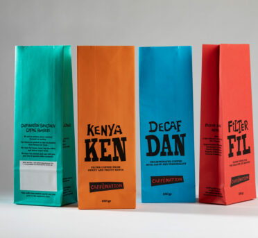
Did you know that colours on a screen can appear different to colours on paper? So don’t trust blindly in a design on a screen. Even if colours are printed on paper, there is a great difference. Have you heard of the colour systems CMYK and Pantone? Read this blog article to recognise the difference and allow your colours to leap out perfectly.
2. Colours: switch from labels to printing
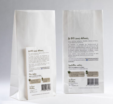
Is applying labels costing you a lot of time and money? If so, making the switch to a printed bag could be the solution. Do you have labels or other materials such as visiting cards, other packaging etc.? Send them to us, along with the technical information on the colours. This enables the correct colour conversion to be made. Naturally, we can help you further with the entire process. Find more information here.
3. Colours: go for 2 x white on brown kraft paper
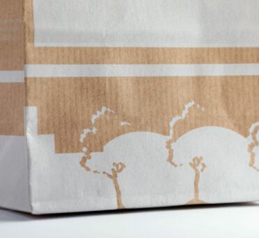
Do you have a design that uses white on brown kraft paper? If so, we recommend using 2 layers of white. This ensures that the white is reproduced properly. And did you also know that printing white on brown kraft paper is a fairly unique thing? There are only a few printers who have succeeded in achieving this attractive effect.
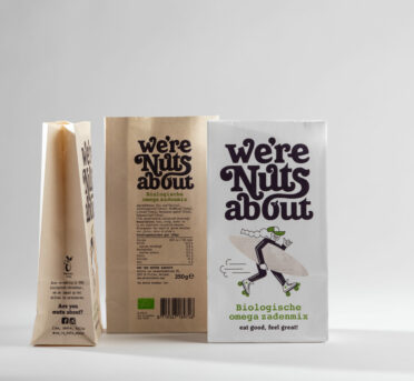
4. Colours: every paper reproduces colours differently
In your design, take account of the fact that colours are reproduced differently on different types of paper. Light colours, such as yellow for example, have a different effect on brown kraft paper than on white kraft paper. Sometimes, an extra layer must be provided to allow the colour to be striking. Naturally, we are happy to advise you based on your design.
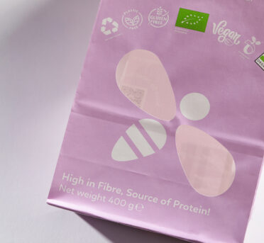
5. Window: show a part of your image
Have you designed your own window to display your product? We are definitely an advocate of this! When you design your window, ensure that part of the image is still printed. As in the example of the bee, if you also make the white elements transparent, the ability to recognise the image is lost.
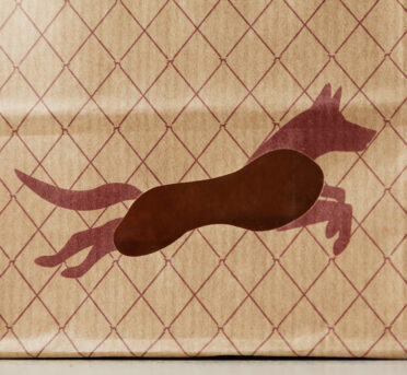
6. Window: avoid too sharp edges
When designing a window, take into account the fact that circular shapes are preferable to sharp angles and sides. Too sharp edges are more likely to result in small tears. If you already have a window with corners and edges, we will always indicate what is technically possible.
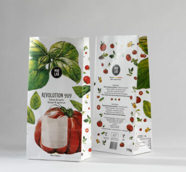
7. Window: don’t let your design disappear behind your window
Do you have a (standard) window in your design? If so, check that this is positioned correctly, i.e. not too high or too low. Do you use an image that runs through your window in your folding plan? Ensure that your image is still clear when the window is rendered transparent.
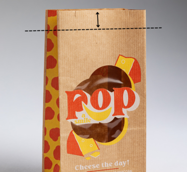
8. Closure: allow sufficient space
When designing your packaging, think also about how you are going to close it. Will you be using closure strips or sealing? With closure strips, allow sufficient space above your design. It would be a shame if your logo or a significant part of your design were to disappear behind your closure strip. You can find more information about closing with a closure strip here.
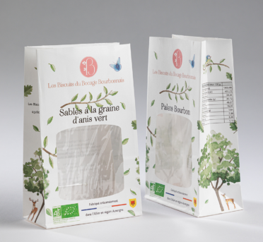
9. Side fold: go for visible images and legible text
Text or images in the side fold can have an attractive effect. Your design can look superb in a folding plan. But also ensure that the text is legible and images are clear when the folding plan is folded into a bag. You can test this by creating a mock-up model of your bag.
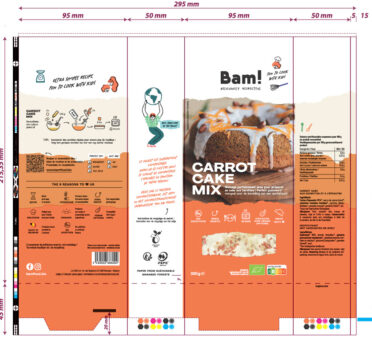
10. Create a mock-up model of your bag
Have you taken all of the tips into account and want to know if you have made the most of your design? We recommend that you create a mock-up model of your bag. This will give you an initial impression of how it will look in reality. You can find more information about how to create a mock-up model here.
