Colours explained: CMYK vs Pantone
An beautifully printed bag starts with a beautiful design. The end result is largely determined by the technical approach to the development of your design. During the prepress phase, your design is examined in detail and readied for printing.
An essential part of your design is the composition of the colour. If you’re not familiar with the terms Pantone, CMYK, etc. read on to learn everything you need to know about these colour models.
The colour systems: RGB, CMYK and Pantone
RGB
In the print world, you’ll mostly hear people talk about CMYK and Pantone, but a little bit of background about RGB won’t go amiss.
RGB is a colour coding that consists of the three primary colours: Red, Green and Blue. This is used when you display an image with light: for example, on your TV, computer or smartphone screen.
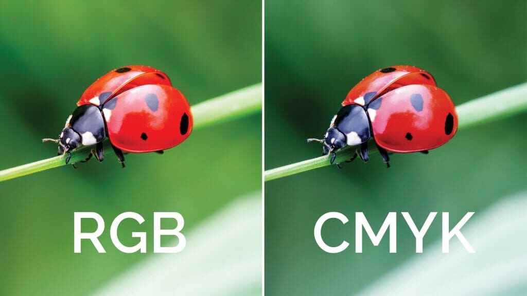
It is an additive colouring system, which means that if you mix two colours you get a lighter shade. If you combine red, green and blue, you get white light (illustration on the left).
There is also a subtractive colour system, which is used for printing. This works the other way round. Mixing colours ensures that less light is reflected, and you get a darker colour (illustration on the right).
The main thing to remember is that a colour does not have the same impact on your screen as when you print it. That’s why we work with the CMYK and Pantone colour systems for the printing of your paper bags. We also recommend that you print out your design in order to see the colour on paper. If you do print your design, you can make a mock-up model. That way you’ll have a better impression of the whole design. Read more about this in the blog article “Making a mock-up model of your bag”.

CMYK
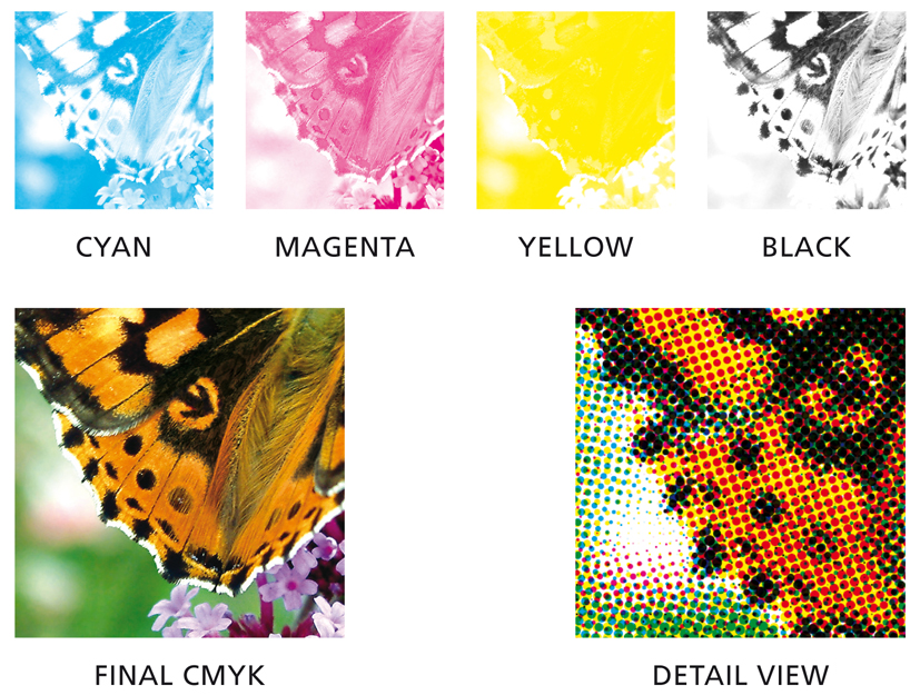
CMYK, also called quadri, full colour or 4-colour printing, stands for the print colours Cyan, Magenta, Yellow and Key (black). Your home and office printers also work using this system. By combining these four colours, a complete image is built up.
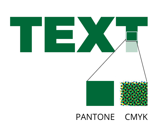
How does it work? A CMYK image consists of four different layers of each colour printed on top of each other. The image is made up of tiny dots, similar to pixels on a screen, which are only visible with a magnifying glass. By combining these four colours in different doses, all the colours in the CMYK spectrum can be reproduced.
PMS: Pantone colours
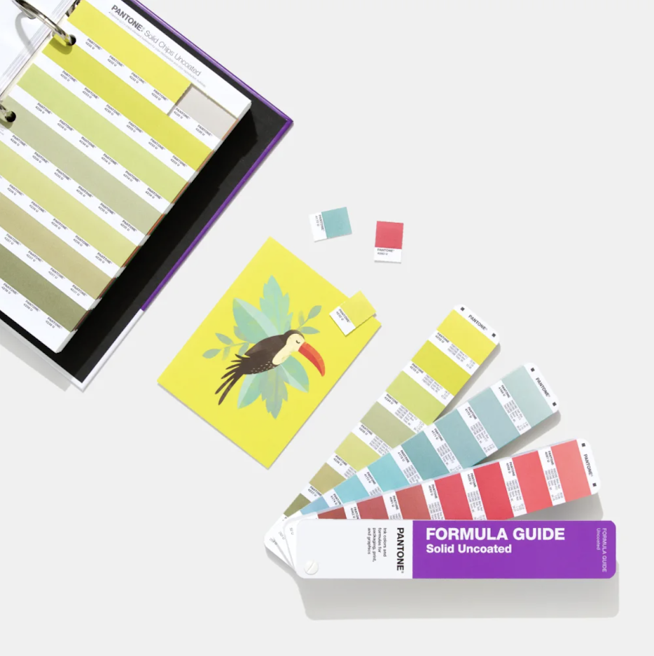
PMS stands for Pantone Matching System. With CMYK, a colour is obtained after printing, whereas with Pantone, the colours are mixed beforehand.
So you can choose from a very wide range of standardised shades, each with a unique code. In our production, the inks are mixed in advance according to fixed colour formulas. It is comparable to the RAL system applied to the paint used on walls.
How do you choose the right colour? A Pantone colour guide is a must-have! This contains all the possible colour nuances, along with the unique Pantone code followed by a C or a U. This refers to the type of paper to be used for printing: Coated or Uncoated paper. Coated paper has a coating that makes the paper smooth and creates a glossy effect. Uncoated paper does not have this coating. This paper is therefore rougher, and has a matt effect.
CMYK versus Pantone
CMYK and Pantone are different colour systems, but does it make a difference whether you create your design in CMYK or Pantone? It certainly does!
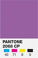
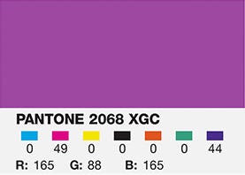
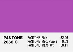
Not every colour available in Pantone can be printed in CMYK. This is because CMYK uses only four colours to build a shade. Did you know that 55% of all Pantone colours can be printed using CMYK?
To expand the range, the 7-colour process (extended gamut) was introduced. Three additional shades are added to the four basic CMYK colours, usually orange, green and violet. Using this system, up to 90% of Pantone colours can be printed.
Since not all colours are equally easy to print in CMYK, we often choose to print an additional Pantone colour, depending on how important this element is in the design. Below we offer some guidance as to whether to use CMYK or Pantone.
Which colour system is used for what?
As we mentioned, the composition of your design is important for a successful end result. Both colour systems are often used in a design as they each have their own strengths. Often, a design using CMYK is accompanied by additional Pantone colours.
CMYK is used to print detailed images.
For brand colours and logos, Pantone is the best option. That’s because the defined colour formulas ensure that your brand colours are always the same, promoting brand consistency and recognition. For example, Coca Cola red has a unique Pantone code so it’s recognised all over the world.
Where else should you choose Pantone? For larger areas, or if the colours need to stand out more. This is because CMYK is printed in a dot matrix and Pantone is more opaque.
Pantone is also used for fine texts and very thin lines.
And did you know that white doesn’t exist in CMYK? So if your design includes white, a Pantone white must be used. White is also used as a base to make darker colours stand out better.
Curious about how your design is developed? Talk to your designer. We prefer to work closely with the designer during the design phase. That way, we can provide advice on the design, the colour composition and how we would print a design. This prevents a lot of repeated work and extra costs at a later stage! Any questions? Don’t hesitate to contact us!


Note:
- https://www.pantone.com/articles/product-spotlight/what-is-extended-gamut
- https://printingsolutions.com/cmyk-printing/
- https://help.tradeprint.co.uk/hc/en-us/articles/360010059074-What-is-Spot-Colour-Printing-
- https://www.ngsprint.com/blog/spot-vs-process-thats-the-color-question/
- https://www.printdeal.be/nl/producten/huisstijl/pantonewaaiers-kleurenwaaiers
- https://printingshoppe.com/help-center/importance-of-cmyk-color-mode/
- https://www.graphicartsmedia.com/magazine-stand/expanded-colour-gamut/
- https://www.advancedlabelsnw.com/blog/3-misconceptions-about-pantone-colors-for-labels
